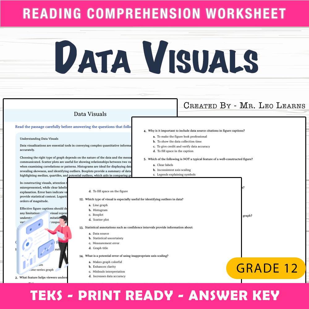
Grade 12 Science – Data Visuals Worksheet for Mastering Graphs & Charts
Description
Imagine standing in front of your classroom, preparing to introduce your students to the importance of effective data communication. As you distribute this worksheet on data visualizations, you notice their curiosity grow but also their confusion about which graph types to choose and how to interpret them accurately. This worksheet provides a clear, structured path through the complexities of understanding graphs and charts, helping students build confidence in analyzing and creating visual data representations while minimizing instructional prep time.
What This Resource Helps Students Do
This worksheet is designed to guide students through the essentials of data visualization, emphasizing comprehension of various graph types, their appropriate uses, and interpretation skills. It encourages independent practice with real-world scenarios, reinforcing concepts such as understanding distribution patterns, variability, and data comparison. The questions foster critical thinking and help students learn to select the most effective visual tools for different datasets, supporting both conceptual understanding and practical application.
Inside the PDF
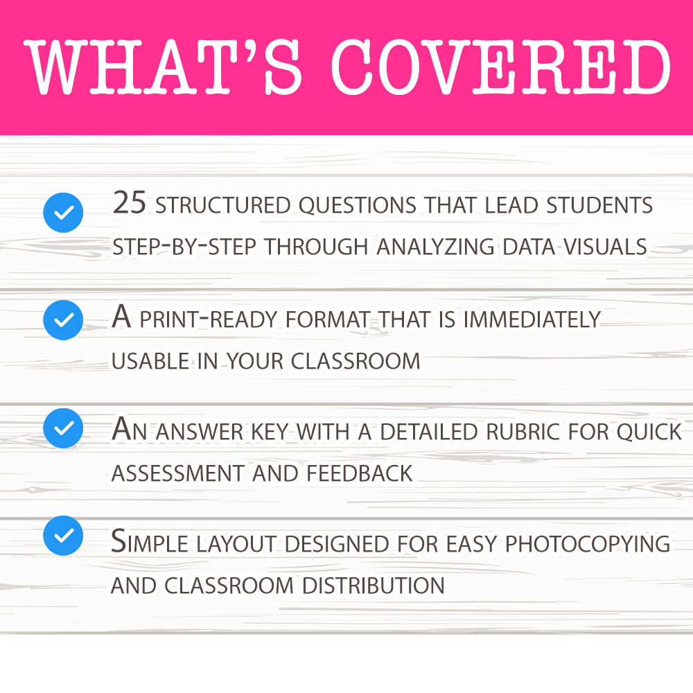
• 25 structured questions that lead students step-by-step through analyzing data visuals
• A print-ready format that is immediately usable in your classroom
• An answer key with a detailed rubric for quick assessment and feedback
• Simple layout designed for easy photocopying and classroom distribution
How It Improves Learning
This worksheet improves student understanding by engaging them in active learning about data visualization. The questions challenge students to distinguish between different graph types, such as bar graphs, histograms, scatter plots, and pie charts, helping them recognize which is most suitable for various data sets. The process of analyzing visual features, such as axes, labels, and data points, boosts their reasoning skills. Additionally, the practical scenarios encourage students to interpret real-world data, which enhances their ability to synthesize information. The structured format of the worksheet offers clarity and confidence, reducing confusion and supporting mastery of key concepts in data analysis.
Core Skills Students Will Develop
- ➡️ Interpreting different types of data visualizations
- ➡️ Selecting appropriate graph types for specific datasets
- ➡️ Understanding data variability and distribution
- ➡️ Analyzing visual features to extract meaningful information
Ways Teachers Use This Worksheet
This worksheet serves multiple instructional purposes. It can be used as a classwork activity where students practice interpreting data visuals collaboratively or individually. It also functions well as homework to reinforce concepts covered during lessons. Teachers may incorporate it into assessment review sessions or small-group discussions to deepen understanding. Additionally, it is an effective tool for early finishers seeking meaningful practice or as a quick formative assessment to gauge student comprehension of data visualization topics.
Why This PDF Saves Time
This ready-to-print worksheet simplifies lesson planning by providing a comprehensive, well-structured activity that requires no additional preparation. Its clear layout and print-ready format ensure swift distribution during class, saving time on creating materials from scratch. The included answer key with rubric supports efficient grading and feedback, allowing teachers to focus more on instruction and student engagement rather than assessment logistics.
With this worksheet, you have a reliable, classroom-friendly resource to help your students master the essentials of data visualization confidently. It’s designed for ease of use and effectiveness, ensuring your instructional goals are met with clarity and consistency. 📊